

Pantone describes it as a “reassuring . . . life-affirming color.” It also looks like the nuclear isotope in The Simpsons.
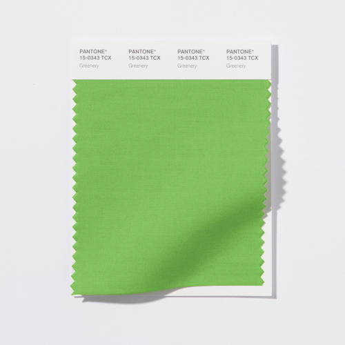
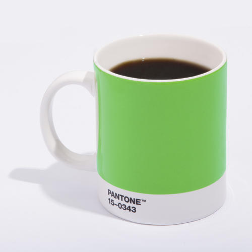
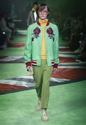
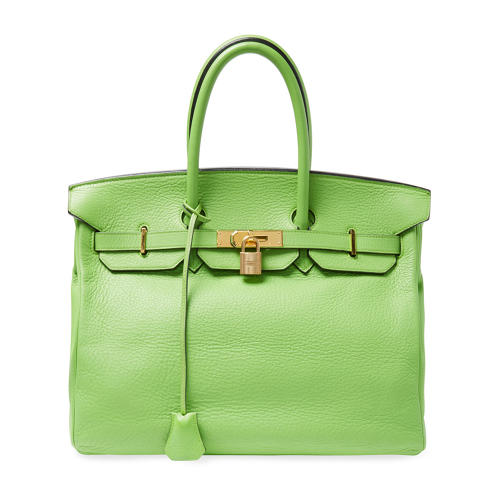
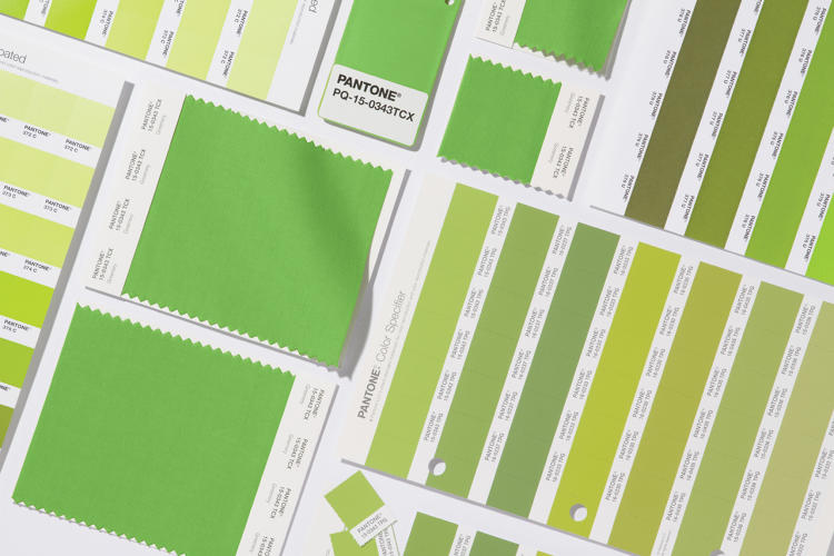
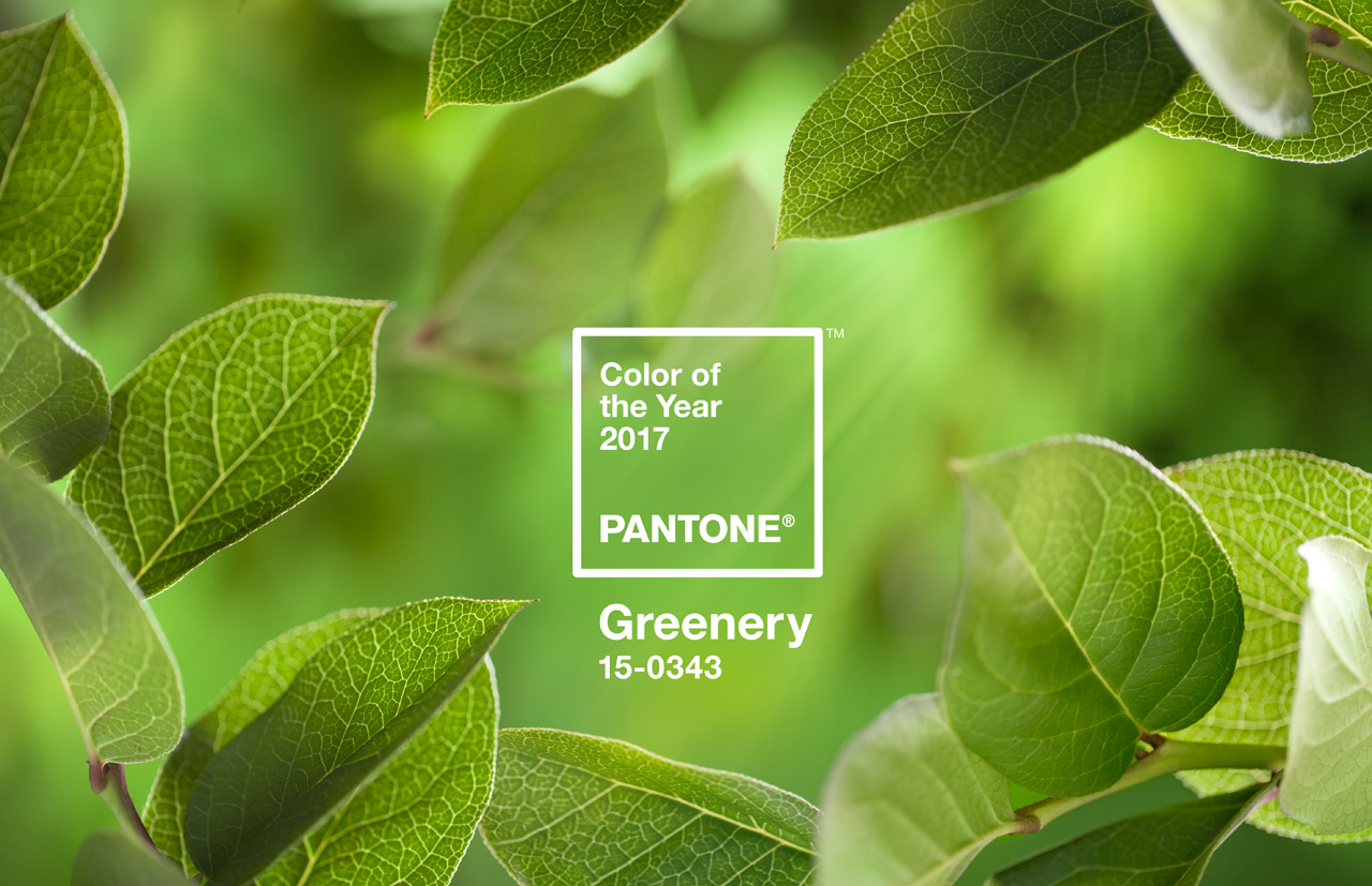
Bucking the national mood, Pantone has selected a decidedly optimistic new color of the year: 2017 will be the year of Greenery (15-0343 TCX), “a fresh and zesty yellow-green shade that evokes the first days of spring when nature’s greens revive, restore, and renew.” Too bad half the country is seeing red—and orange.
In a release, Pantone Color Institute executive director Leatrice Eisenman said:
“While Serenity and Rose Quartz, the Pantone Color of the Year 2016, expressed the need for harmony in a chaotic world . . . Greenery bursts forth in 2017 to provide us with the hope we collectively yearn for amid a complex social and political landscape. Satisfying our growing desire to rejuvenate, revitalize, and unite, Greenery symbolizes the reconnection we seek with nature, one another, and a larger purpose.”
Pantone’s Color of the Year is the company’s contribution to a cultural conversation. “For us, it was coming up with a way to communicate what’s taking place in our language,” Laurie Pressman, vice president of the Pantone Color Institute, told Co.Design last year. “It’s our way of chiming in. We speak a language of color. So we see things in color. We can explain things in color.” In 2016, it selected pink and blue to address blurring gender dynamics, and in 2015 it picked a liverish red.
This year, Pantone is putting forth a message of positivity and rebirth in the wake of a grueling election, a rise in hate crimes, state-sanctioned violence,economic uncertainty, and anxiety about the environment. “Our lives are accelerating even faster, tech is more overpowering, and the global climate is more complex,” Pressman says. “The big macro driver here was getting back to nature.”
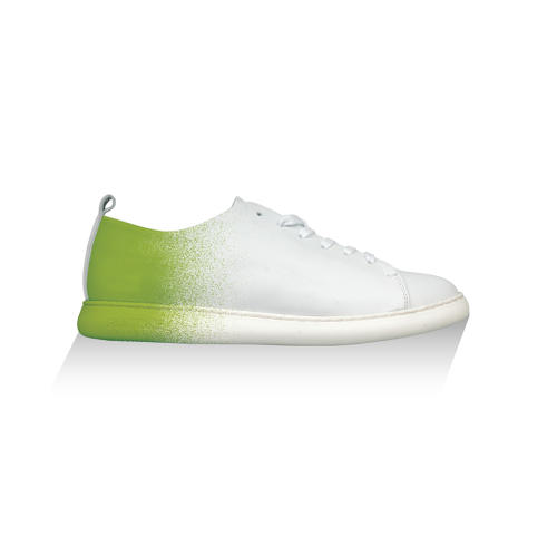
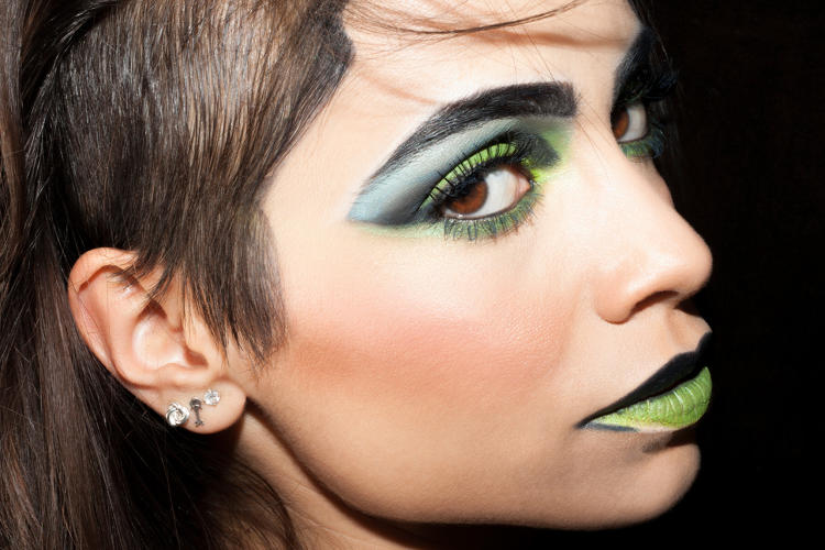
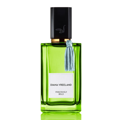
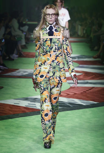
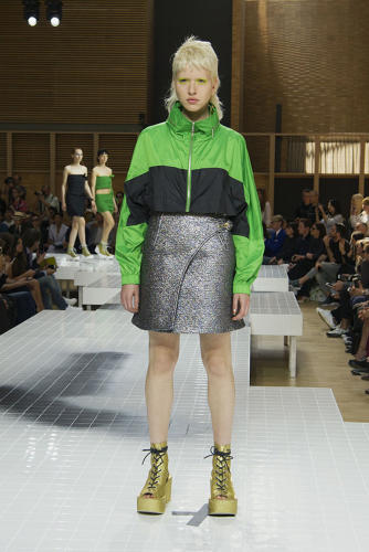
But it’s not all cheery green walls and kale smoothies (inspirations for this year’s colors, incidentally—as were Kylie Jenner, Lena Dunham, Katy Perry, and Madonna, who have all dyed their hair green). What strikes me about the hue Pantone selected is that it’s an artificial-seeming yellow-green. Sure, it’s the color of matcha and Granny Smith apples, but it’s also what I associate with Jolly Ranchers, the nuclear isotope appearing in the opening credits of The Simpsons, and Slimer from Ghostbusters. Moreover, green today has somewhat of a pejorative connotation. Green texting bubbles—opposed to the blue of Apple’s iMessages—are perceived as cheesy. A Co.Design editor quipped that Scott Pruitt, Trump’s climate-skeptic nominee to lead the EPA, can mandate it as the official shade of fake grass after global warming renders it impossible for grass to grow naturally.
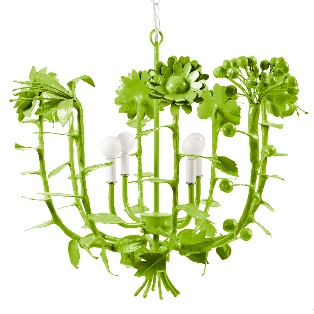
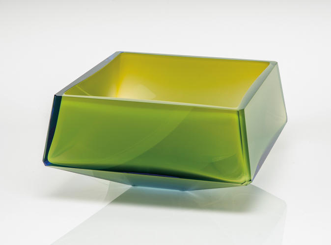
Stray Dog Designs, Terrell Swan
“It’s a yellow-based green that gets its warmth and energy from the sun—a hotter green, a reassuring green, a life-affirming color,” Pressman says. “This wasn’t meant to be soothing. This was meant to be bold. We’re living in a time where you voice needs to be heard.”
Taken in sum, I think the color is an appropriate choice for 2017. There’s a drive—and desire—for freshness, but there’s a tinge of sourness, much like biting into a Granny Smith.
Source: Co.Design | business + design